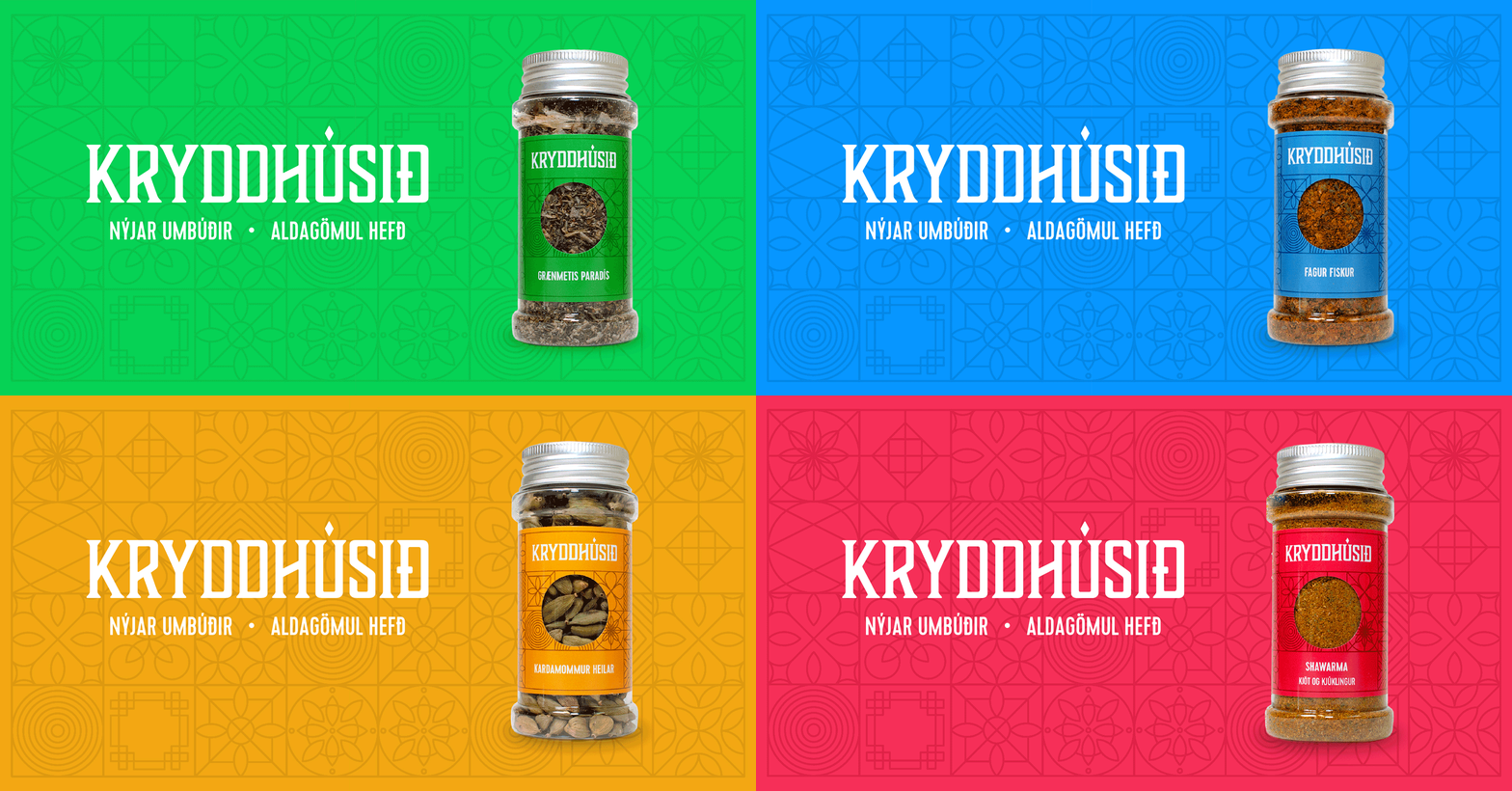
Kryddhúsið

Rebranding
The project was to rebrand a company that produces spices.


Inspiration
Inspired by spice bazaars from the middle east


What they do
Kryddhúsið imports spices straight from spice farmers around the world.

Brand visuals
The shapes in the branding are geometric form from a arabic tradition

Colours
The spice categories are 4 and are marked with a colour

Colours
The colours give the design a strong connection to exotic countries

The project was done at Jökulá. All product shots taken by Killian Lopes Sanches
